PatchWord (2026)
Peoplefun
My Role:
Game Designer, Level Designer
On PatchWord, I owned the game's design from initial concept through prototyping, including writing the MVP spec, iterating on the core loop mid-development, and driving the FTUE design that got the game to a place where players could actually enjoy it.
PatchWord went through more meaningful design evolution than most prototypes I've worked on. The version that made it to user testing looked quite different from what I first specced out — and that gap is where most of the interesting work happened.
My key contributions across the project were:
Write the initial MVP spec and establish the first playable build based on a Sudoku and Woodoku-inspired concept, then rapidly redesign the core loop after the first internal playtest revealed that, while there was something interesting in the concept, the Sudoku rules and structure were limiting the fun.
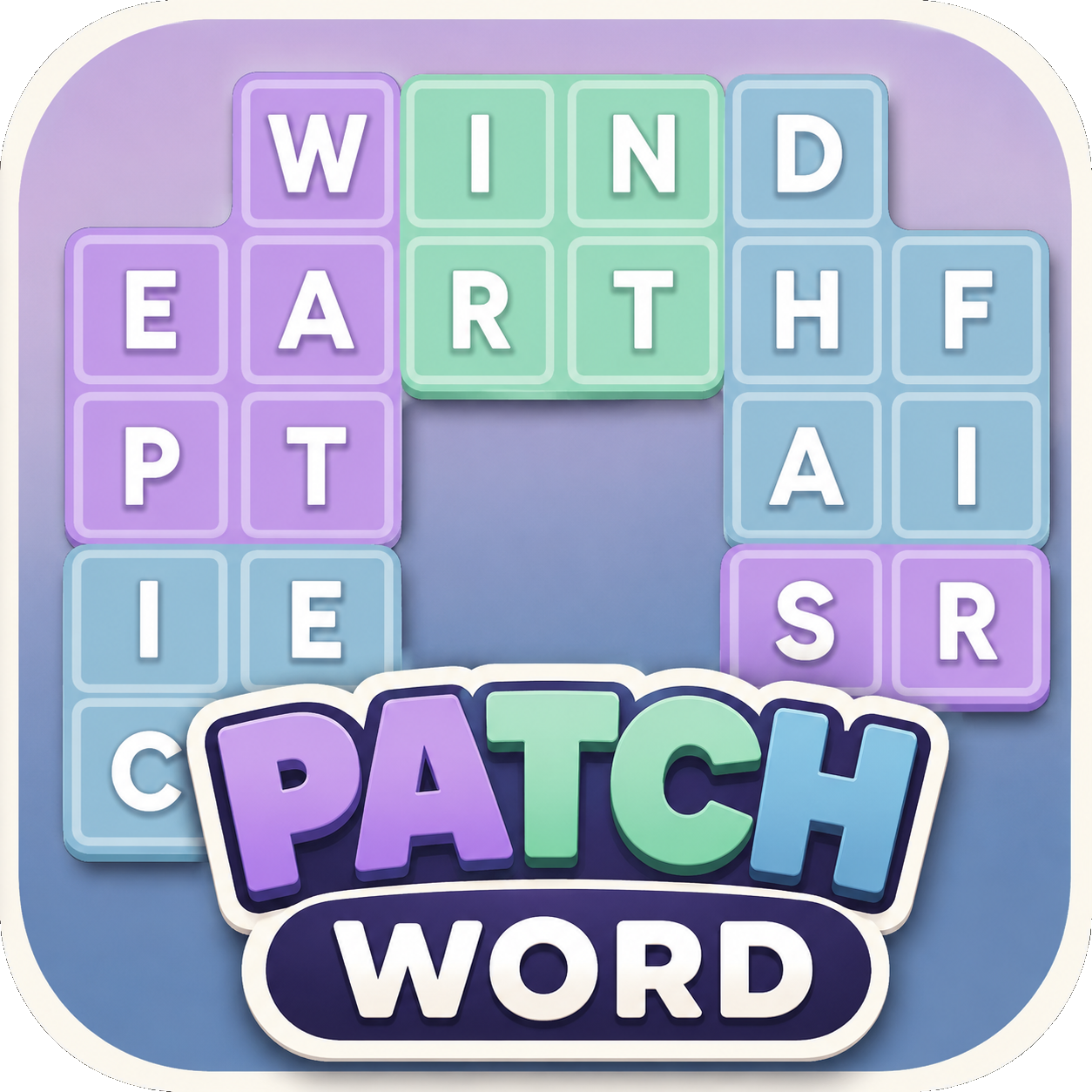
Redesign the board system from uniform 3x3 grids to color-coded, uniquely shaped sections. This was a change that turned every level into a visually and strategically distinct experience and helped give the game its identity.
Define the level goal and win condition, shifting from a board-clearing objective to collecting tiles of a specific color, which gave the game a cleaner, more satisfying loop and a natural lean into match-3 hybrid territory.
Diagnose and solve a significant FTUE problem, using iterative user testing to identify exactly where players were losing the thread — then redesigning the tutorial flow, UX, and even the game's vocabulary to fix it.
Project Process & Breakdown
Where It Started:
PatchWord began as a fusion of the spatial pressure of Woodoku and the sectioned-grid logic of Sudoku. The initial concept put players on a board of random letters divided into 3x3 segments. Swiping letters to spell words would highlight the tiles used, and clearing an entire row, column, or segment would turn the letters into solid tiles. The goal was to turn every letter on the board into a solid tile to clear the level.
While interesting, this first concept introduced some very tricky challenges to solve, and cases that made levels nearly impossible to beat as you neared the end. The Woodoku aspect was quickly scrapped, and instead of turning letters into blocks, they were cleared from the board and replaced by new letter tiles. After we played the first prototype build, we knew there was something interesting here, but we wanted to make several changes for the next iteration.
Finding the Real Game:
The Sudoku structure that felt clever in the spec felt rigid and predictable in play. Every board looked essentially the same, and the clearing conditions didn't create the kind of satisfying moments we were hoping for. Rather than iterate on the surface, I went back to the fundamentals and made a few structural changes that ended up redefining what PatchWord actually was.
The row and column clearing was dropped entirely, as it was pulling the game toward Sudoku when the more interesting part was the ever-changing game board, as sections were filled in. The uniform 3x3 grid was replaced with irregular, color-coded sections that varied in shape and size from level to level. Suddenly, each level had its own unique layout and strategic approach.
From there, the level goal evolved naturally: Instead of clearing the whole board, players were given a target: collect tiles of a specific color by spelling words through that section. This small shift gave the game a clear win condition, a more focused objective per level, and an unexpected, but satisfying lean into the match-3 genre. Internally, people kept replaying the same levels, watching the cascades of letters fall down as one or even multiple sections were cleared off at the same time. This was a really strong signal that we were on to something.
Each level felt unique with its bespoke shape and section layout, and requiring players to collect specific colored tiles meant they were not only encouraged, but required to spell words all across the game board. The same colors were often represented in different areas of the level, so if the player had a hard time filling in letters in one area of the board, they could move to another part of the board instead. The shape of levels and the sections within played a much bigger role in this iteration: A level with long, narrow sections often proved to be difficult to fill in, and sometimes the player had to clear other sections until the right letters landed in the section they actually wanted cleared. Levels with smaller sections allowed for quick clearing, but yielded less progress towards the goal, while large sections could clear a goal in one quick swoop, but it took far more effort to clear. This gave players meaningful strategic decisions to make, depending on their needs in the moment.
Challenges:
The most demanding part of this project was making the onboarding and teaching of the game itself to brand-new players. This was due to all the conditions required of the player to make progress in the game: Spell valid words, then with those words fill in a section of the same color, THEN you score. In classic match-3 or word games, your payout comes immediately after you make the right move, but here it was delayed. It required players to often make multiple moves for a payout. While this feels satisfying and has a nice setup into payoff, it meant the game felt far less intuitive than most word or match-3 games.
In the first user test we ran, most players didn't intuitively grasp the rules at all, and were visibly and audibly frustrated as they did not understand what they were meant to do. And in the second user test, we had tutorials in place, but nearly half of the players still didn't fully understand the game loop. What made this particularly tricky was the nature of the confusion: players weren't completely lost. They almost grasped the rules, but often drew the wrong conclusion as to why they won the level. So they would clear a level with ease, but misunderstand exactly what they did to win.
The cause-and-effect chain of; spell a word>highlight tiles>fill a section to collect it needed to be broken into explicit steps and taught one at a time, then reinforced through early levels. I changed the vocabulary in tutorials by referring to each section as “Patches” rather than “Sections”, tying the vocabulary directly to the game's title and giving players a consistent word to anchor the concept.
In addition to this, our tech artist made UX adjustments to make the board's sections read more clearly at a glance and changed the in-game language.
The difference in subsequent tests was significant, as nearly every player understood the rules within the first three levels, with all testers confident by level five. The frustration and hesitation we'd seen early on were replaced with curiosity instead, where players were forming their understanding and eagerly testing it to confirm they understood the rules.
Takeaways:
An engaging game loop is not the same as an understandable one, and on mobile especially, you can't afford to assume players will figure it out if they play long enough. If onboarding is fighting the game's complexity, you'll lose players before they ever get to the part that would have hooked them.
Keeping the game loop clear and intuitive will do a lot of heavy lifting in the onboarding phase of your game, and you can spend more time thinking about how to build on top of that loop rather than spending resources teaching it.
My Role:
Game Designer, Level Designer
In Tap Jam, my core responsibilities were designing the core game mechanics and the level and puzzle design.
Due to our team size, I worked closely with the Project Manager and helped lead the project from pre-production to market test. Additionally, I utilized my past QA experience to vet and report any bugs discovered in the testing process.
During the project’s development, my main notable contributions were:
Create the layout and simulate the gameplay step by step to tweak the puzzle’s solution and iterate as I went along without engineering support.
Hand-code the majority of the puzzle levels (~50 levels) utilizing a JSON script which was imported into Unity. This was due to the lean nature of the game’s development cycle and the fact we did not create a level editor tool initially.
Define and provide team support on the UX and functionality of the puzzle mechanics for the game’s unique mechanics (Mystery Tiles, Tile Spawners, Special Shaped Tiles, Jelly Tiles, and Frozen Tiles), ensuring that each mechanic had a unique look and feel, and communicated its functionality in a clear way.
Ensure that the game’s UX felt smooth and satisfying by having animations sped up and utilizing snappy sounds based on feedback from internal and external testing.
Analyze player progression and adjust game levels where there was a significant drop-off or unintended rise in level fail rates.
Project Process & Breakdown
Pre-Production:
The goal of Tap Jam was to create a low-cost game with good early player retention, session lengths, a low cost-per-install rate (CPI), and a project that had a fitting scope for our small team and our expertise in casual game development.
The PM and I looked at similar hyper-casual puzzle games such as Unpuzzle, Screw Jam, and Coin Match 3D as they fit the scope and KPIs we sought. I found that each of the games had a few key features for success, which I then translated into our core game design pillars:
Easy-to-understand core loop
The core loop has to be understood almost immediately with very brief tutorials to get players going.
Snappy and satisfying UX
The gameplay needs to have a tactile feel to it through UX, sound and pacing. Each move should feel satisfying to make and quick enough that players can make consecutive moves in a rapid fashion without any delays.
Tension and release pacing
The game should have moments where the player is almost out of options, and where a single move creates exciting chain reactions into a satisfying conclusion.
I conveyed these pillars to the team, and since this was a market test, no level editor was created. Our first milestone was creating a handful of easy, medium, and hard levels that demonstrated the basic gameplay, and a method for me to design these levels. I hand-coded the levels utilizing a JSON script which we fed into Firebase, which was our server-based software that let us make changes without requiring new builds.
Early look and feel:
I did not have prior experience with designing levels for a slide puzzle before, so I had to establish a workflow that allowed me to design solvable levels, and gauge the challenge rating before implementing levels into the game. For this, I used Google Slides, as it is my go-to for quick mockups. I created a “tile palette” and a grid system serving as a template for each level. This way I, or anyone who wanted to participate in level creation, could easily copy-paste from the palette into the grid, and quickly see the design restrictions.
I would often start with a single concept, such as “I want to teach players that they can move tiles into other tiles”, “I want to introduce a new mechanic and force players to observe or interact with it”, or “I want a level to look intimidating, but in reality is really easy and almost impossible to fail (Only very perceptive players would catch on to this)”. I would create a first draft, then solve it move-by-move in Google Slides to emulate the gameplay. This proved very effective and allowed me to vet levels with the team before implementing them into the game.
Changing the tile design:
We initially used colored tiles with white arrows, which allowed for the creation of pixel art puzzles, but it affected the game’s readability with future game mechanics. We switched to white tiles with color arrows, and this allowed for seamless game readability when special tiles were introduced in later levels.
The PM and I discussed and agreed that introducing mechanics early was important to:
Demonstrate to players that the game experience is ever-evolving, and
Communicate that there are new surprises around every corner if they keep playing.
In addition, I designed the UX to display the remaining levels required to beat before the next game mechanic is unlocked. My hypothesis was that this helped increase player session length and retention.
Level Mechanics:
For the market test, we had five new level mechanics we introduced over the game’s initial content: Mystery Tiles, Spawner Tiles, Special Shape Tiles, Ice Tiles, and Jelly Tiles. It was important to me that each new mechanic felt unique from the previous and could be used in tandem or combined with all other mechanics. I approached each mechanic like the level tools found in the Mario Maker games, where they could stand on their own feet, but if combined with another, it would create a wonderful synergy. With that in mind, each mechanic could in theory be layered on each other (i.e. a Freeze Tile could reveal a Mystery Tile when melted, or a Jelly Tile could hide a Special Shape when all the jelly was removed).
User Testing:
We conducted external user testing, which verified that almost every player fully understood the gameplay mechanics and dynamics 3 to 4 levels into the game. I keep the “goodwill” system from Steve Krug’s book, “Don’t Make Me Think” in mind when gauging a player’s retention and stickiness.
In his book, Krug views patience as a resource that can be depleted and refilled through various actions and gestures when a user interacts with your designs. But once the goodwill is spent, the user will leave, and most likely never return. My goal was to ensure the first 5 levels were impossible to fail to guarantee players had time to get invested in the game before throwing any real challenge at them and ensure that there was no early game friction. I designed some levels to look challenging, but in reality, there was very little chance for danger.
Additionally, I made sure that even difficult levels that utilized spawners and mystery tiles were not difficult due to players having to guess the right move. Some of the titles I researched had this, and it never felt fair or fun when I failed a level because I happen to pick the wrong move in a 50/50 scenario. Therefore, even when players had to make a guess, the guess should not cause a fail state, but instead up the importance of the player’s next move and they were forced to make another risk assessment. If a player failed a level, it should always be apparent to players what caused the failure and how to correct it next time.
Takeaways:
The team was able to successfully prototype Tap Jam and create an engaging and innovative puzzle game in three months. We had plans in place to further develop daily reward systems, add more player boosts, and utilize more of the game’s softcurrency after initial market testing, but unfortunately, Lion Studios chose not to continue developing Tap Jam after only one week of market testing.
Even so, I am ultimately proud of the work I and the team put into the game and the experience gained along the way. In the pre-production phase, I discovered and improved on elements that hook players in some of the most successful casual games out there. During the level design phase, I developed an effective workflow with the limitations we had for creating complex puzzles for a genre I had not worked in before, and I further developed my skills in puzzle design specifically.
Got any questions?